Give customers a reason to stay
Make repeat orders feel rewarding.
 · 2022
- +2.5%
- net revenue
- +2.6%
- order rate
- +14%
- app adoption
Overview
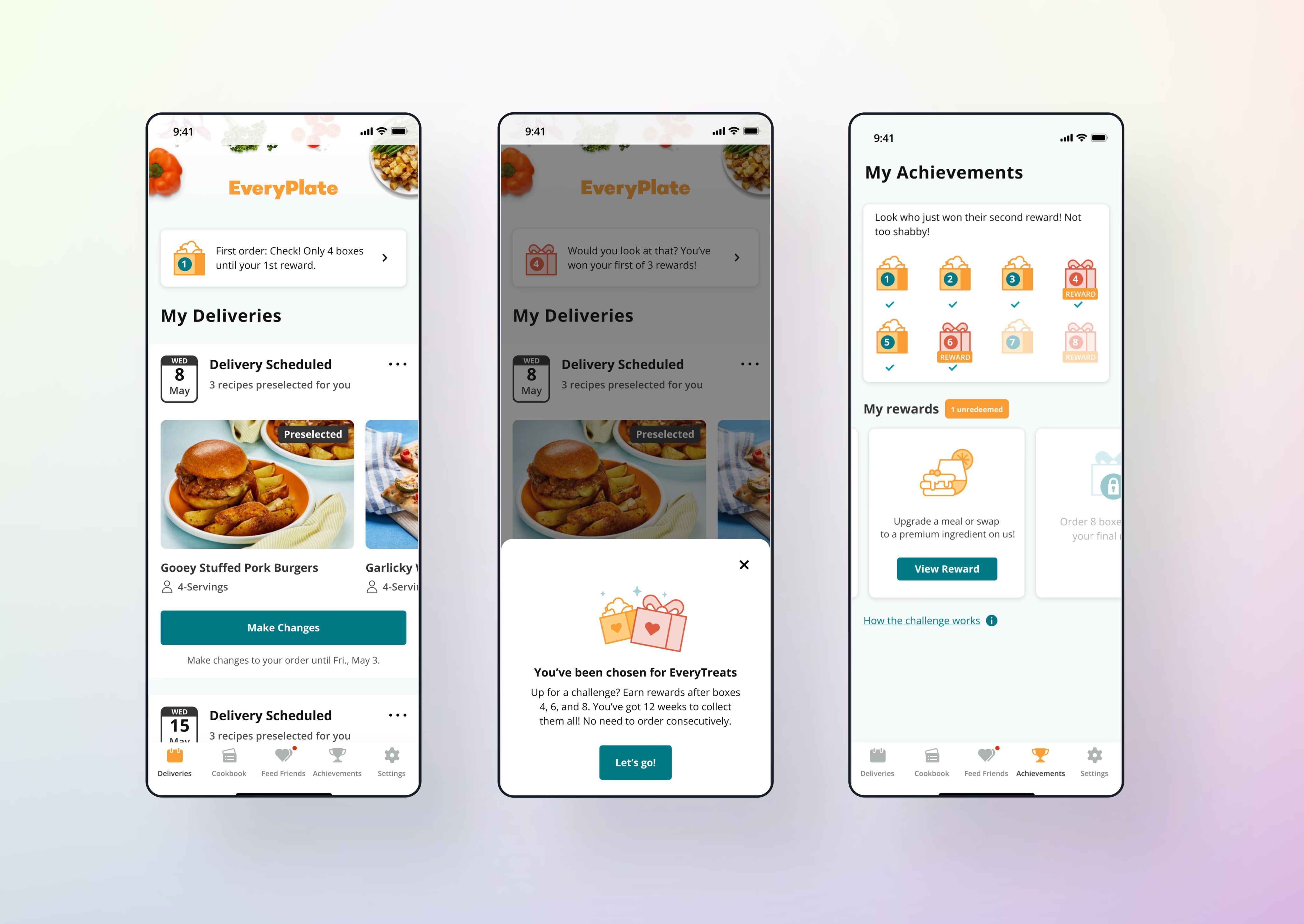
EveryPlate is an affordable meal-kit service within the HelloFresh group, with more than 20,000 active customers. Customer surveys showed that some people questioned the value of meal kits, while regular customers wanted their loyalty recognised and asked how to access discounts.
I worked with product, engineering, research and UX writing to design a loyalty challenge: order eight boxes over twelve weeks and earn three rewards, after boxes four, six and eight. My scope covered workshops, customer research, the end-to-end experience and iterations after usability testing.
Give customers a reason to keep ordering
The question was how to motivate customers to stay, recognise the value of the service and reorder meals they enjoyed. I led workshops and research to turn that goal into a challenge with clear rules, visible progress and straightforward redemption.
The programme needed multiple entry points so customers could discover it while using EveryPlate, then return to their progress as they placed more orders.
Eight boxes, twelve weeks, three rewards

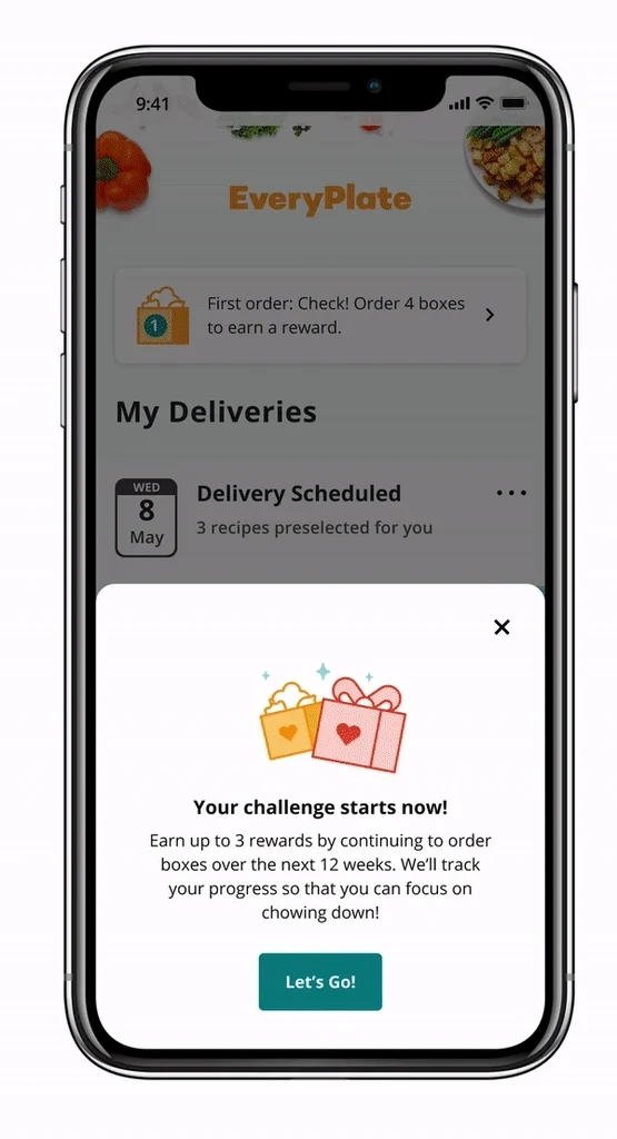
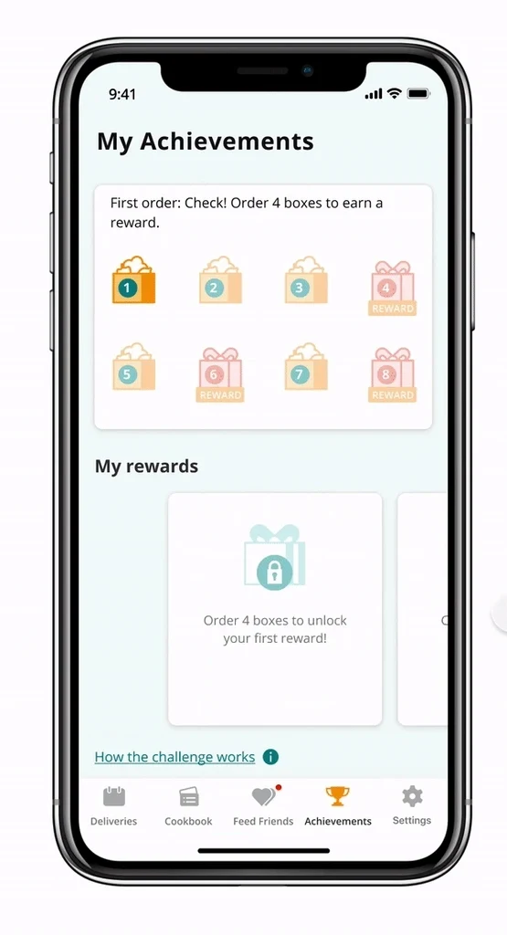
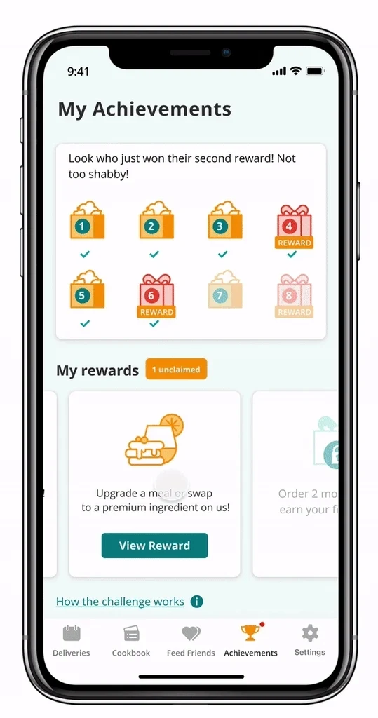
The welcome experience introduces the challenge and explains how orders count towards rewards. A tracker shows completed boxes and upcoming milestones, while the achievements page brings progress and rewards together.
Rewards stay concealed until unlocked, creating anticipation as customers work towards the next milestone. The surrounding information still needs to make the challenge and its time limit clear.
Keep the reward model reusable
The business wanted more engagement and repeat orders, within two constraints: one reward type, repeated up to three times, and logic that could be reused across four white-label brands.
I designed the welcome, progress, reward and redemption states around that shared model, with touchpoints across the app and web.
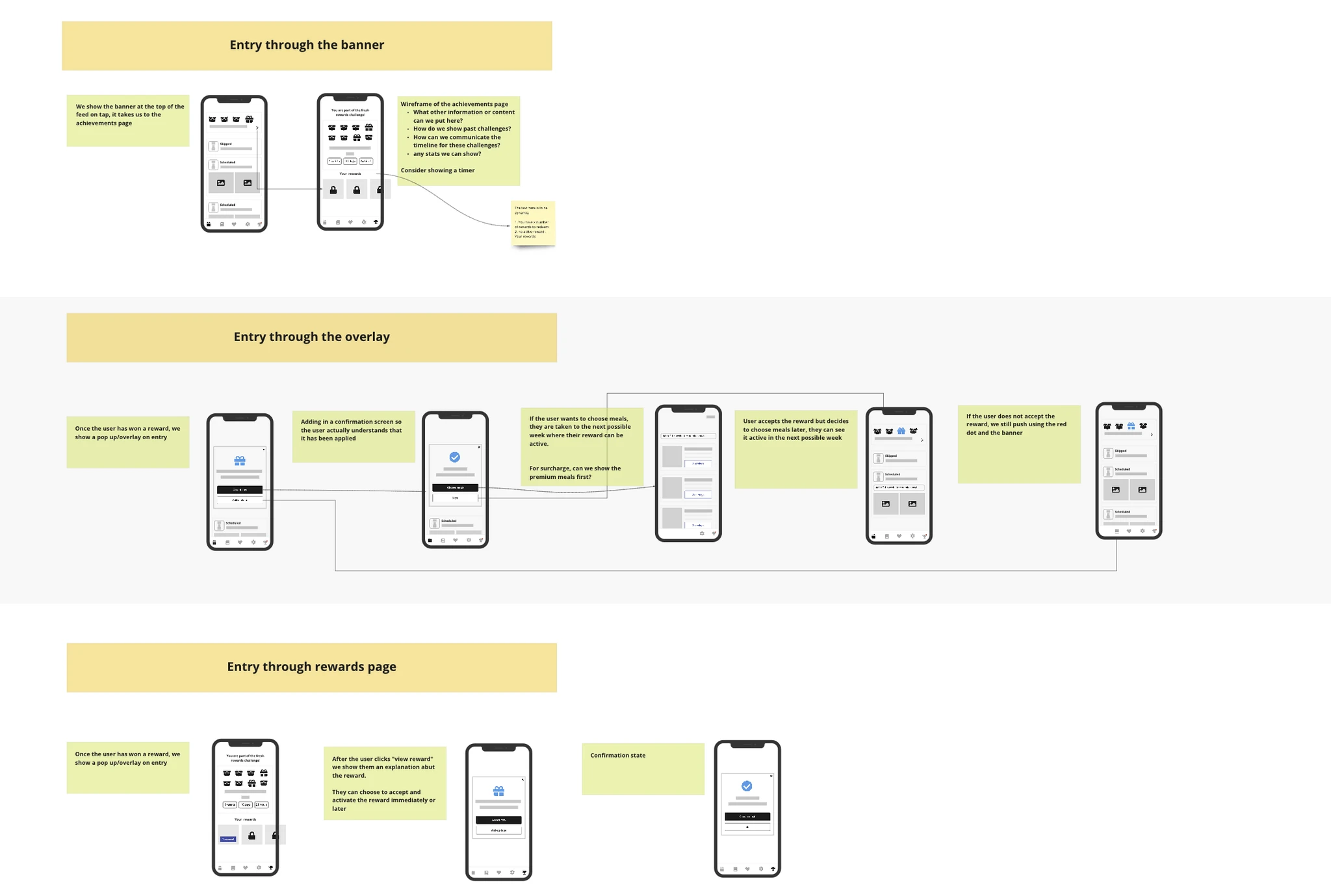
Testing made the missing information clear
Early iterations explored the invitation, progress tracker and achievements page. I refined the illustrations, simplified the achievements view and reduced how much information appeared at once.
Usability testing then pointed to four specific changes. I updated the wording and reward states so customers could understand the rules and see what had happened to their reward.
- State “eight boxes in twelve weeks” in onboarding and the instructions.
- Make it clear when a reward has been applied.
- Show when rewards expire.
- Describe the rewards more clearly.

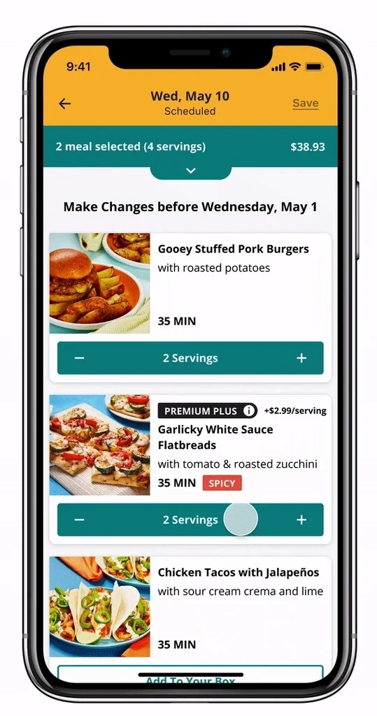
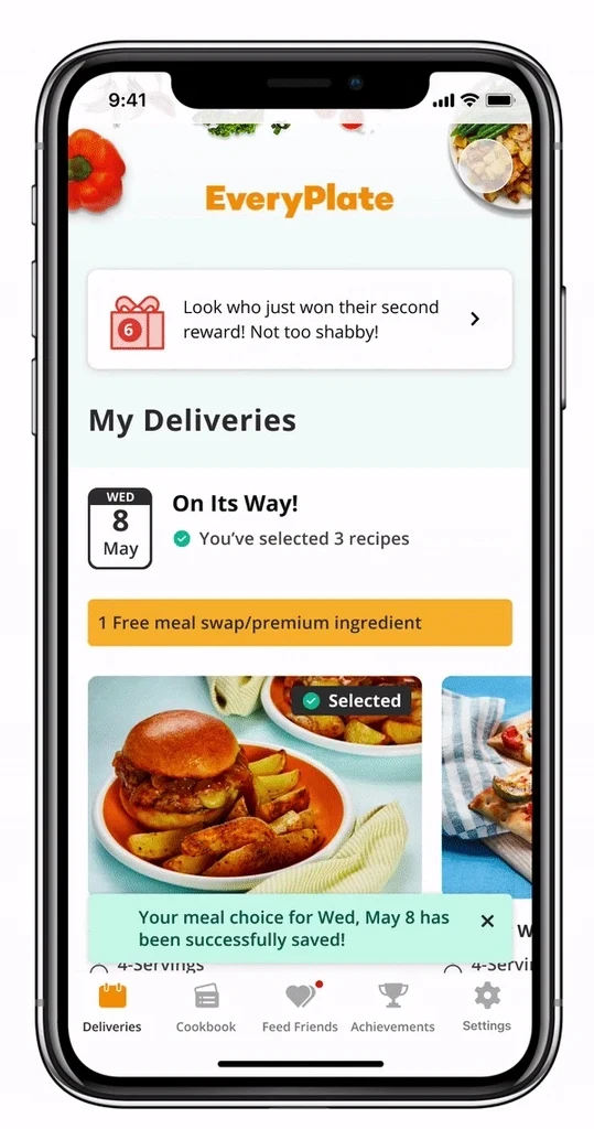
Make redemption feel like a reward
I created a gift animation for reward redemption. Alongside the updated reward states and copy, it gave the moment of claiming a reward a clear visual response.
The loyalty programme increased net revenue by 2.5%, order rate by 2.6% and app adoption by 14%.

Key decisions
Explain the challenge at entry and keep progress visible as customers order.
Treat redemption, applied status and expiry as essential parts of the reward experience.
Use a reward model that can work across four brands.
Let’s talk about the work.
I’d be happy to talk through the project and the decisions behind it.
Reach out